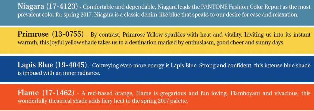
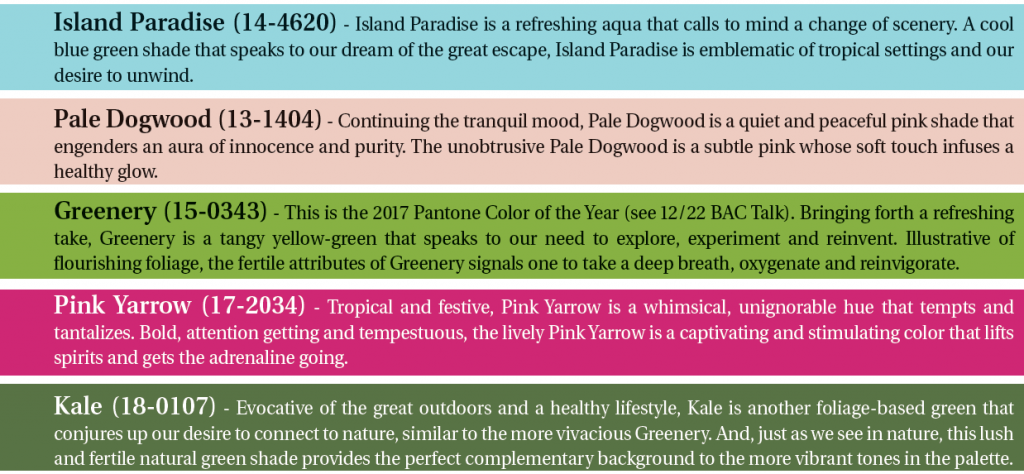
As designers showcased their upcoming looks for Spring 2017 at New York’s Fashion Week, color experts at the Pantone Color Institute were taking notes. The company just released its top 10 colors in fashion, consisting of the hues that stole the spotlight on the runway. The Spring 2017 Fashion Color Report evokes a spectrum of emotion and feeling. From the warmth of sunny days with PANTONE 13-0755 Primrose Yellow to the invigorating feeling of breathing fresh mountain air with PANTONE 18-0107 Kale and the desire to escape to pristine waters with PANTONE 14-4620 Island Paradise, designers applied color in playful, yet thoughtful and precise combinations to fully capture the promises, hope and transformation that we yearn for each Spring. As you start planning your spring promotions, keep these colors in mind to stay on trend!
Through the Pantone Color Institute, Pantone continues to chart future color direction and study how color influences human thought processes, emotions and physical reactions. Pantone furthers its commitment to providing professionals with a greater understanding of color and to help them utilize color more effectively. For the latest news, trends, information and conversations, connect with Pantone on Facebook, Twitter, Pinterest, and Instagram.