Color of the Year 2018
Each year, our industry waits in anticipation for a big announcement… the Pantone Color Institute’s Color of the Year. Their announcement came last week, and their color of choice has everyone in the marketing and branding industry talking: ULTRA VIOLET.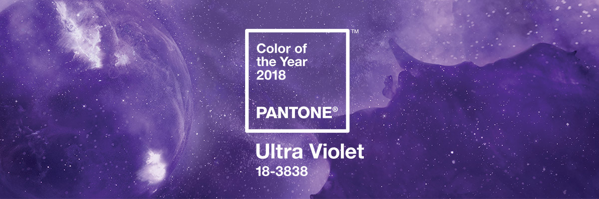
The rich, blue-based purple is simultaneously rebellious and calming; both a signature shade for recently departed rock royals like Prince and David Bowie, and a hue deeply associated with mystics, healing and mindfulness.
“A dramatically provocative and thoughtful purple shade, Pantone 18-3838 Ultra Violet communicates originality, ingenuity, and visionary thinking that points us toward the future,” the Pantone team says.
WHY IS THIS ANNOUNCEMENT IMPORTANT FOR YOU AND YOUR CLIENTS?
The Pantone Color Institute helps companies make the most informed decisions about color for their brands or products. Whether it is color trend forecasting, brand color development, custom color solutions, or product palette selection, the Pantone Color Institute guides creative designers and brand marketers through the development of a color strategy that fits a company’s unique needs.
The Color of the Year is one moment in time that provides strategic direction for the world of trend and design. In fact, Color of the Year is a culmination of the Pantone Color Institute’s year round work forecasting trends and developing color palettes for their clients.
ABOUT ULTRA VIOLET
After years of minty greens and soft pastels, Pantone is changing things up by announcing Ultra Violet as the 2018 Pantone Color of the Year.
“Complex and contemplative, Ultra Violet suggests the mysteries of the cosmos, the intrigue of what lies ahead, and the discoveries beyond where we are now,” they add. “The vast and limitless night sky is symbolic of what is possible and continues to inspire the desire to pursue a world beyond our own.”
The Pantone team says that passionate purple has always drawn artists and musicians.
“Enigmatic purples have also long been symbolic of counterculture, unconventionality, and artistic brilliance,” Pantone says. “Musical icons Prince, David Bowie and Jimi Hendrix brought shades of Ultra Violet to the forefront of Western pop culture as personal expressions of individuality. Nuanced and full of emotion, the depth of Pantone 18-3838 Ultra Violet symbolizes experimentation and non-conformity, spurring individuals to imagine their unique mark on the world, and push boundaries through creative outlets.”
ULTRA VIOLET IN GRAPHICS DESIGN AND PACKAGING
As packaging design becomes more sophisticated, Ultra Violet offers complexity and nuance that appeals to our desire for originality in all that we touch. Similarly, in graphic design, Ultra Violet resonates with this dynamic medium through its multi-dimensional feeling. Shades of Ultra Violet are increasingly used in packaging and graphic design by forward-looking brands in the CPG, luxury, and beauty worlds as well as by personalities and artists seeking to stand out.
ULTRA VIOLET IN FASHION
On the runway or the streets, Ultra Violet is an enchanting purple that provides a theatrical linkage for both men’s and women’s styles. True to the coupled nature of Ultra Violet, created by combining red and blue, Ultra Violet lends itself to unique color combinations in fashion and is easier to pair with all colors on the spectrum than one might think. With golds or other metallics, Ultra Violet becomes luxurious and dazzling; with greens or greys it evokes natural elegance. Similarly, Ultra Violet takes on distinct appearances with different materials. Lush velvets in the color suggest intrigue for evening, but are also unexpectedly modern in athleisure or sneakers. In accessories, jewelry, and eyewear, Ultra Violet suggests the complexities of natural gems, textures, and florals.
COMPLIMENTARY COMBOS
Pantone has also created eight different color palettes that feature PANTONE 18-3838 Ultra Violet to help designers bring this year’s special shade into your designs. All color bases are covered; brights, deeper hues, pastels, mid-tones, and metallics. With Ultra Violet as a versatile trans-seasonal and gender-neutral anchor in every palette, each of the eight palettes conveys its own distinctive feeling and mood and can easily cross-over fashion and accessories, beauty, home interiors, and graphic design applications. Within each palette, Pantone offers color harmonies to help you get creative with your own ideas of how to use the colors.
We encourage you to visit www.pantone.com to view all of the beautiful color combinations that come with Purple Haze! If you’re looking for product inspiration, check out Numo’s website.
Information source: www.pantone.com